
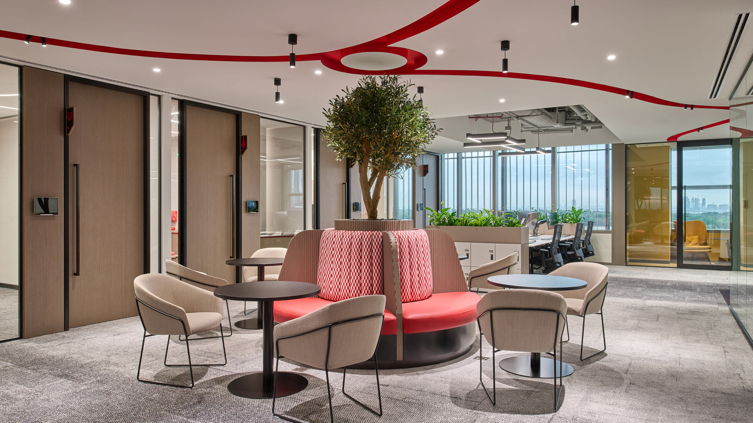
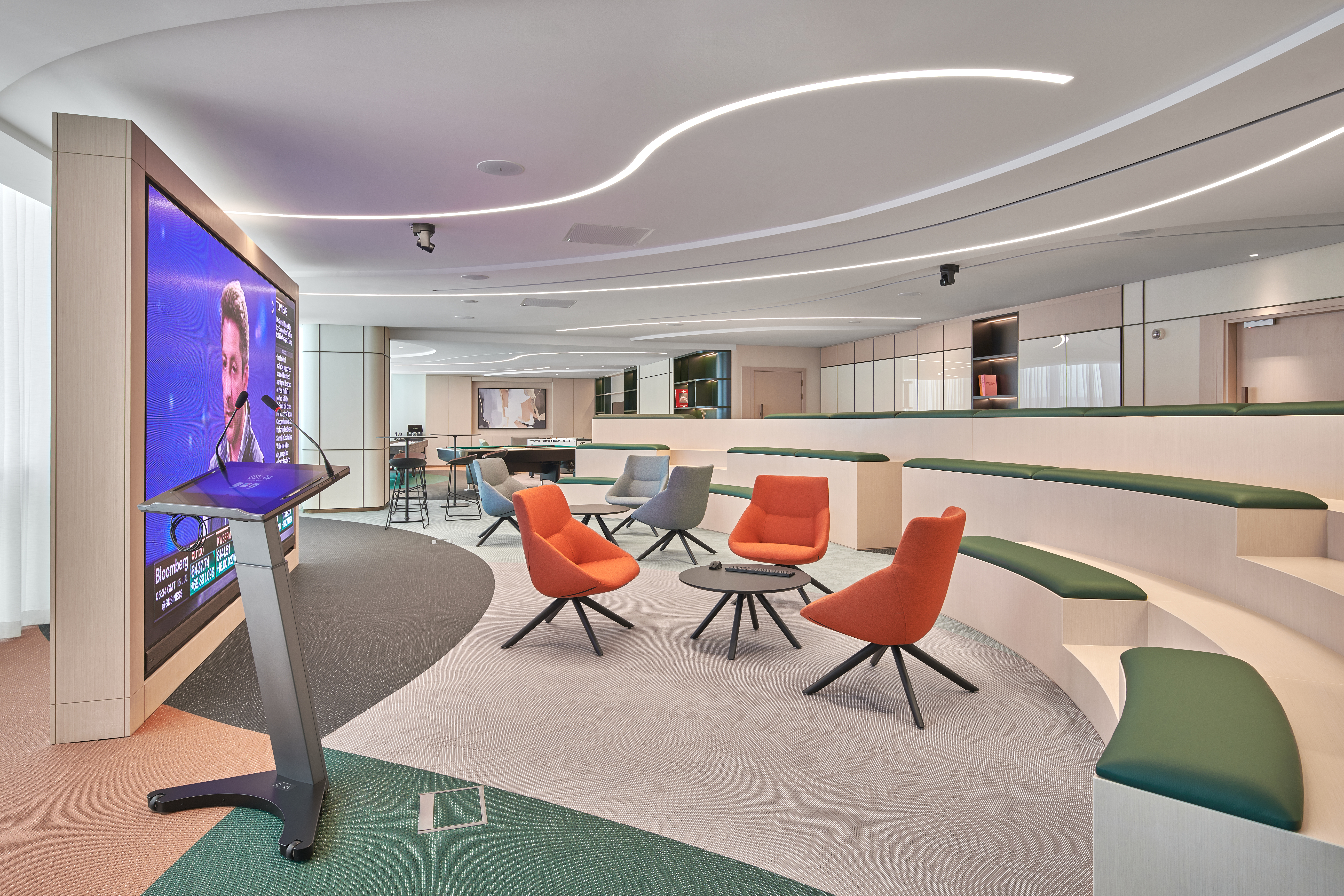
Developing lighting schemes for office spaces often requires some of the most technical solutions from lighting designers. Not only does the lighting have to facilitate a working environment suiting a multitude of people and their needs, but it also needs to be responsive, flexible, and considerate of screens in a way that is unique to the commercial setting.
Light can be a unifying force helping people to emotionally connect to a space and with each other and to create an effective and inclusive commercial lighting design is no small feat. It’s a process, it requires consideration, but above all, when a workspace is the setting, our schemes must guarantee visual ease, leaving no one uncomfortable and as a result, unproductive.
The intensity of light in any office space is one of the most important considerations due to its potentially negative consequences.
You have to be mindful that office lighting needs to support tasks including writing, typing, and reading and if levels are either too high or too low this can have a detrimental effect on productivity.
In considering light levels you must also account for the size of the space, its flow, the fittings, and fixtures used, even wall colour in order to develop a suitable lighting scheme. Individual desk lights can help to account for these factors as well as generate a conducive ambiance around the workstation.
Designers must ensure they blend all fixtures into the overall design intent of the lighting scheme as well as evaluate their impact – be mindful not to simply follow set standards without safeguarding against conflicting illumination levels.
Tip 2 – Avoid Glare
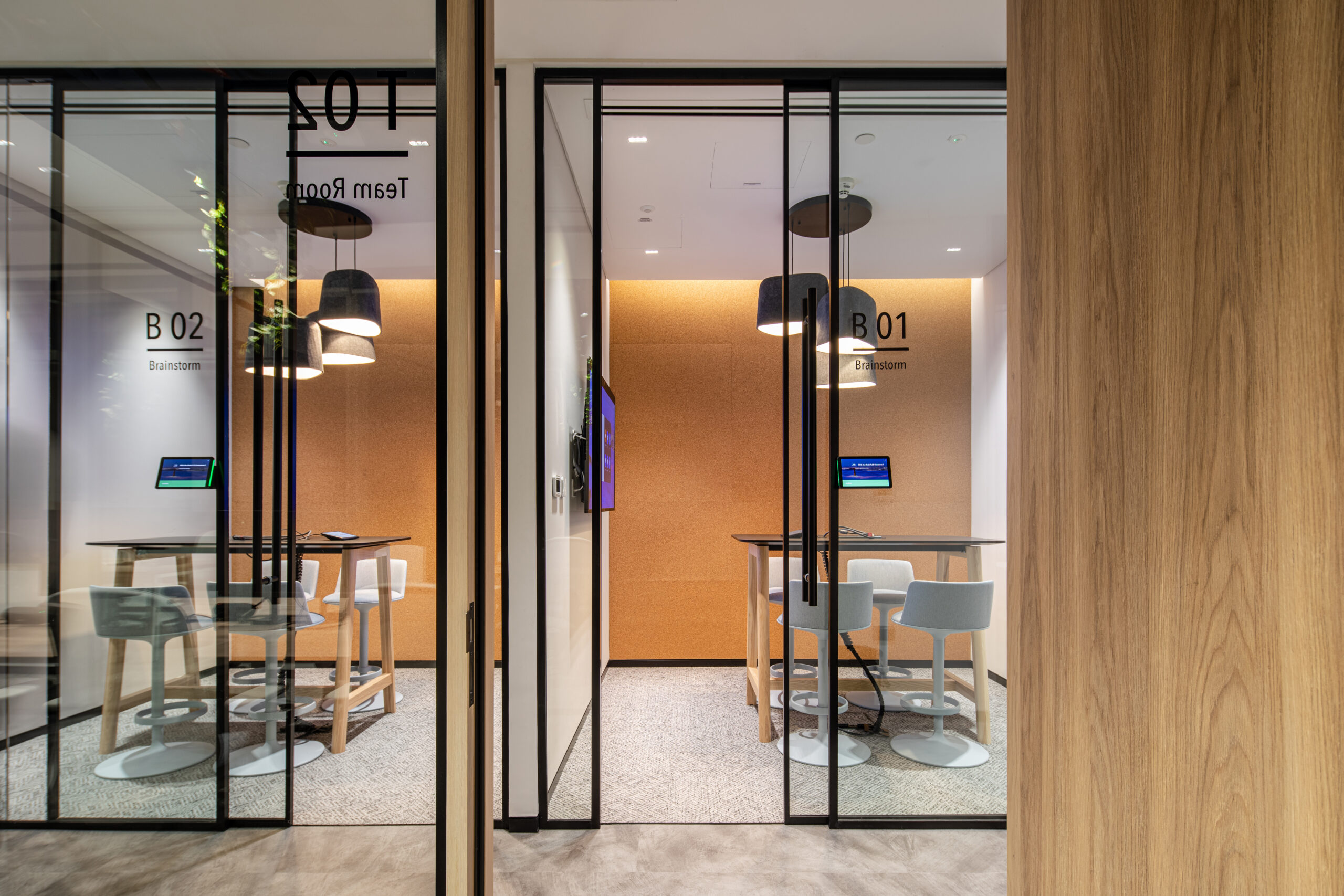
Offices are riddled with opportunities for glare. Computers and TV screens mixed with bright lighting, crisp-coloured walls, and white desks, mean that reflection and bounce back can be a real issue in causing uncomfortable light for users of the space.
Indirect or diffused lighting should be used on vertical surfaces or over desks to help dissipate glare, illumination shouldn’t fall directly onto workstations and wherever possible, all downlights and track lighting should be specified with anti-glare accessories.
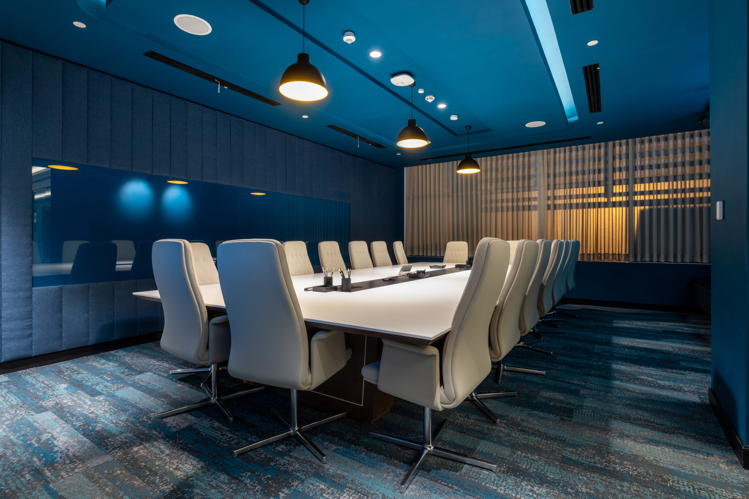
In all spaces that use video conferencing designers should be considerate of contrast ratio – the difference in the bright and dark areas of a scene.
Conference cameras are sensitive and can pick up and enhance the slightest contrast, making scenes unclear to users.
Diffused cylindrical light neutralises any shadows that may fall on the faces of those in the room and vertical illumination behind the monitor negates contrast as well as prevents visual discomfort that may be caused by the brightness of the screen. gl,lb,bl,lb,lg,bl,bb,,bl;,b,belb,l;e,e;r,bel;r,bl;,;kkmklmkmkkkkklkmklmkmkkljkiokoioikioiiiiiiiiiiiiiiiiiiiiiiiiiiiiiiiii
Tip 4 – Flight Flicker
Video conferencing is no longer limited to the boardroom as people now jump on calls all over the office, in the kitchen, in breakout areas and at desks. Phones, as well as laptops, are also used and so lighting schemes need to be conscious of the phenomenon known as flicker.
Flicker is the irritating strobing effect that we see in videos – captured by cameras due to incompatible light fixtures and dimming systems and most common when a project has been value engineered. Imperceptible to the human eye, flicker is becoming a growing issue with our expanding use of screens and video conferencing.
Designers should be vigilant and aim to tune out flicker throughout a commercial space. High-quality fittings and control gear should be employed to mitigate the possibility of flicker on camera, enabling users to video chat without the concern of its effects anywhere within their workplace.
Commercial lighting should be multifaceted yet be seamlessly cooperating with the natural light that is present in the space. To realise this goal, a scheme needs to be fully controllable to help animate and optimise design intent. In the absence of natural light, artificial brightness should be used to achieve a comfortable and inclusive level of light that can be easily controlled through a simple system.
Try to avoid ‘all singing, all dancing’ software, clients frequently ask for an extensive control system, but simplicity is often the key. A complex system that isn’t user friendly usually means that features just don’t get used, resulting in a waste of effort and money.